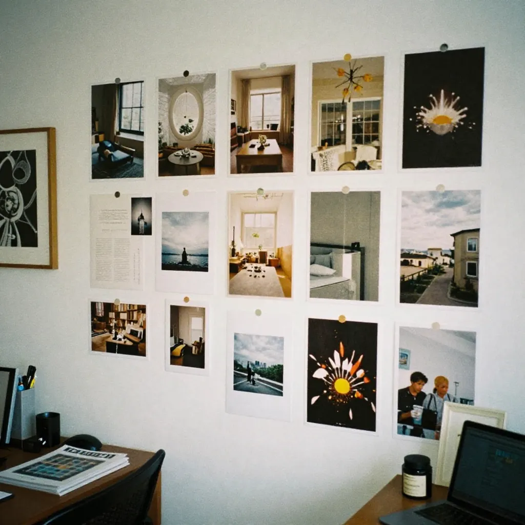
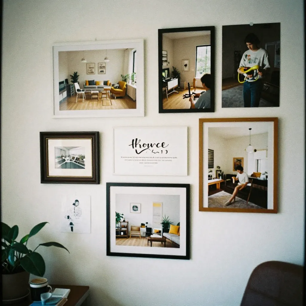
The Texture & Palette Vault
A futuristic periodic table of materials. Discover how textures and colors harmonize to create compelling interior narratives.
Material Mastery
Every material tells a story. Our library showcases how different textures interact with color palettes, creating endless possibilities for your space.
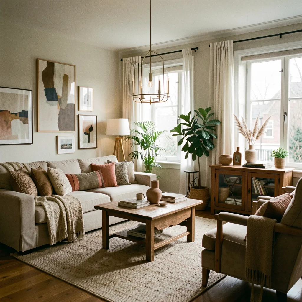
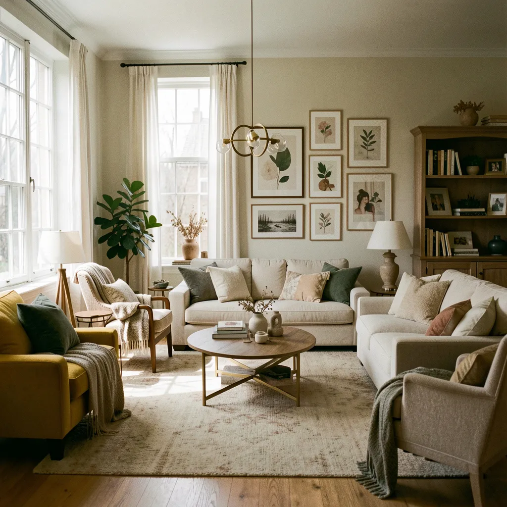
Velvet
Pairs beautifully with deep sage greens, muted terracotta, and midnight ink. Creates a sense of luxury and warmth.
Best with: Rich, saturated tones
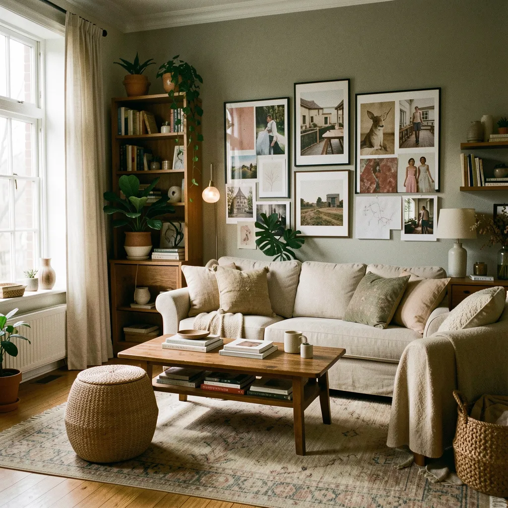
Concrete
Complements warm alabaster, soft bone, and neutral grays. Adds industrial elegance and textural contrast.
Best with: Neutral, earthy palettes
Oak
Harmonizes with warm whites, soft creams, and natural greens. Brings organic warmth to minimalist spaces.
Best with: Natural, organic colors
Application Principles
Understanding material relationships helps create balanced, harmonious interiors.
Texture Contrast
Pair smooth surfaces with rough textures to create visual interest. Velvet against concrete, linen against marble.
Color Harmony
Select colors that share undertones. Warm materials complement warm palettes, cool materials enhance cool tones.
Explore Material Possibilities
Ready to see how these materials can transform your space? Let's discuss your project.
Schedule Consultation